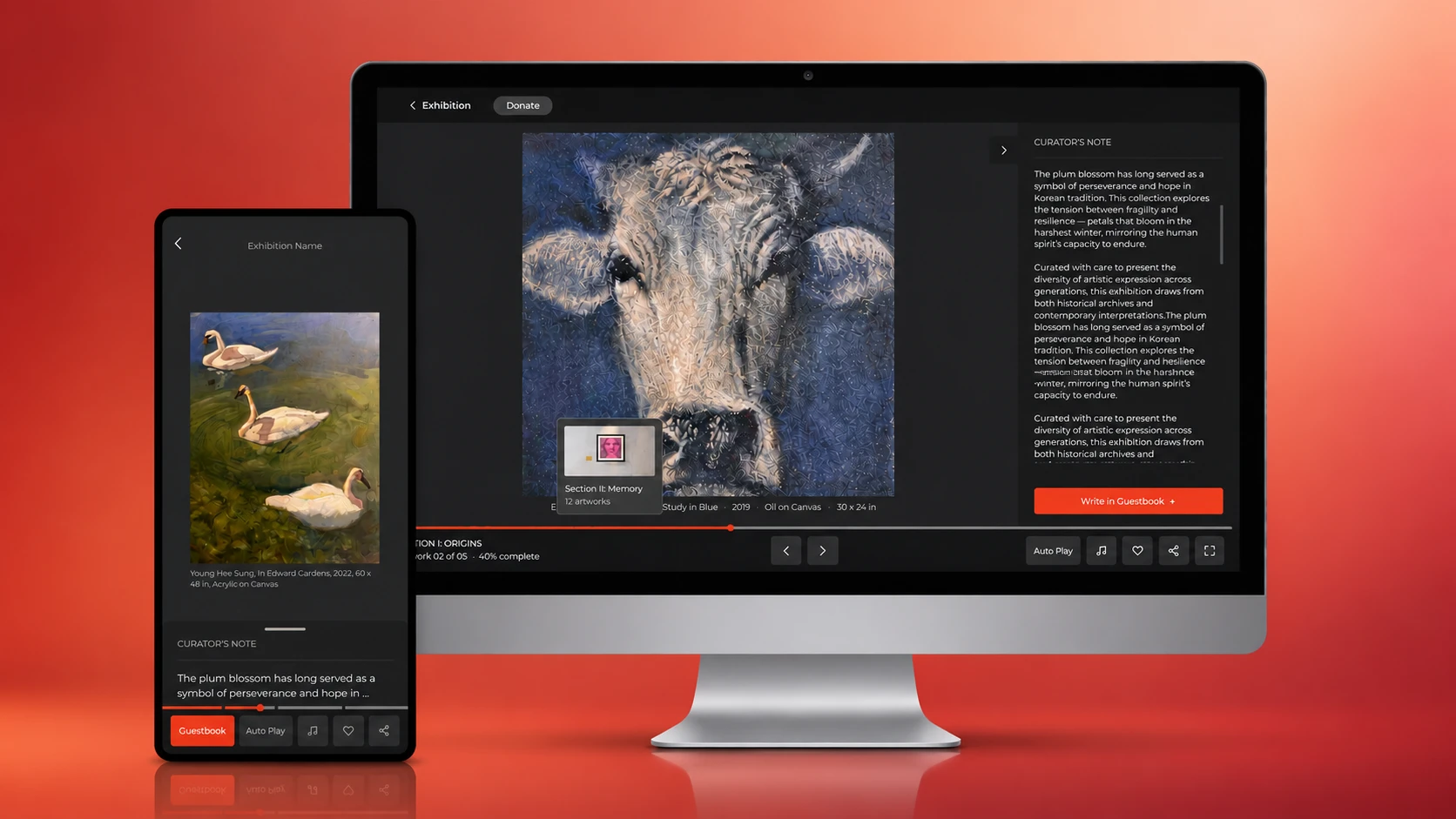
Artistry Community
Artistry Community is an online exhibition platform for emerging artists. While the platform made artworks accessible online, the existing experience felt closer to a slideshow than an exhibition: viewers mainly clicked through pages linearly, and artists gained visibility but little tangible follow-up value.
This project aimed to redesign the exhibition flow so that it could feel more immersive for viewers and more meaningful for artists through stronger structure, richer interaction, and feedback pathways.
After the redesign, artist satisfaction increased by 20%, drop-off decreased by 20%, and average duration increased by 10% despite the page count being reduced from 30 to 20.
Artist interviews revealed that visibility was the platform's clearest value, but also its biggest limitation. All 4 artists said exposure mattered, yet none described the exhibition as leading to strong tangible follow-up opportunities. What they wanted was not just to be seen, but to gain credibility, feedback, stronger context around their work, and clearer pathways to future connection.
Maze testing showed that the viewer problem was not simply about visual preference. It was behavioral. 62% of participants wanted to revisit a specific work or section, and 33% of unfinished participants said the experience was not engaging enough. Heatmaps reinforced the same pattern across layouts: users kept clicking "next" instead of engaging deeply with the artwork. I also observed that drop-off peaked around page 20, when the exhibition was already about two-thirds complete and the content became more text-heavy. 3 out of 6 exits happened at that point, suggesting that repeated next-clicking followed by dense reading created fatigue and encouraged viewers to leave.
wanted to revisit a specific work or section
of unfinished participants said the experience was not engaging enough
"The platform made artworks accessible, but functioned more as a content container rather than an immersive exhibition experience, limiting both viewer immersion and artist opportunity."
Maze showed that 62% of viewers wanted to return to a specific artwork or section. I also observed that drop-off peaked around page 20, when the exhibition was already about two-thirds complete and became more text-heavy. This suggested that the long, forward-only flow was creating fatigue and did not support revisiting well.
Maze showed weak engagement: 33% of participants who stopped said it was "not engaging enough," and 25% wanted bigger images, suggesting a need for closer looking and deeper engagement. Viewer comments described the experience as too static and portfolio-like, while all 4 artists emphasized the importance of artist voice and context.
Maze showed weak post-viewing action signals: the average likelihood of leaving a reaction/comment was only 3.2/5, and the average likelihood of sharing the exhibition was also 3.2/5. In artist interviews, artists repeatedly said that exposure without feedback, contact, or follow-up opportunity did not feel especially valuable.
Together, these features tested whether a more structured, interactive, and feedback-rich exhibition experience could improve both viewer engagement and artist value. We initially had 20 possible ideas and later prioritised them through cross-background voting with design, engineering, and CEO stakeholders.
Make the exhibition structure visible before entering each section, so viewers understand the overall flow from the start.
Reveal sketches or process images behind artworks to add a more layered viewing experience.
Surface context such as inspiration or materials through interactive points on selected artworks.
Collect viewer feedback after the exhibition and give artists stronger evidence of engagement beyond exposure.
For MVP 03 (Visitor Book), the developer raised a safety concern: placing an open text field directly on the exhibition page could attract bot spam, ads, or inappropriate content. To reduce this risk, we introduced an extra step before users could access the input area. We implemented this step through a Google Form rather than a custom-designed page, which also made data collection and handling easier for the development team.
This hypothesis would be supported if:
- exits decreased on longer or text-heavy sections
- users were less likely to leave because of confusion or unclear progress
- completion-related behaviour improved in the revised flow
This hypothesis would be supported if:
- average duration increased even with fewer pages
- users interacted with new features beyond simple next-clicking
- drop-off decreased despite a shorter exhibition flow
This hypothesis would be supported if:
- artist satisfaction increased after the redesign
- post-viewing action signals (reactions, shares) improved compared to baseline
Before : Immediate start to the exhibition
For MVP 3 (Visitor Book), the developer raised a safety concern: placing an open text field directly on the exhibition page could attract bot spam, ads, or inappropriate content. To reduce this risk, we introduced an extra step before users could access the input area. We implemented this step through a Google Form rather than a custom-designed page, which also made data collection and handling easier for the development team.
After a revised Maze test, artist satisfaction rate increased by 20%, and drop-off rate decreased by 20%. While this fell short of the 25% drop-off reduction target, it still showed that the redesigned experience improved both artist value and viewer engagement.
Artist satisfaction rate after revised Maze test
Drop-off rate, despite page count reduced from 30 to 20
Average viewing duration
Pages reduced while improving engagement across all metrics